This weekend I got to pull down from my shelves two framed paper pieces that I’ll be showing at a gallery in St. Augustine next month. (I’ll be a guest artist, and I had to work with my host artist to find a mix of works that look nice together and that fit in a fairly small wall space.)
Doing this reminded me of a great life truth: I love paper collages.
They are pleasurable to make and can be delightful to look at. I began creating paper collages a few years ago as simple, smaller projects in between large quilted works. Paper collages can teach good lessons.
These two, at first glance. Have a lot in common. Similar palette. Same size. Water-inspired images.
But, in putting them together, I used two quite different composition approaches. That’s what I’m thinking about this evening.
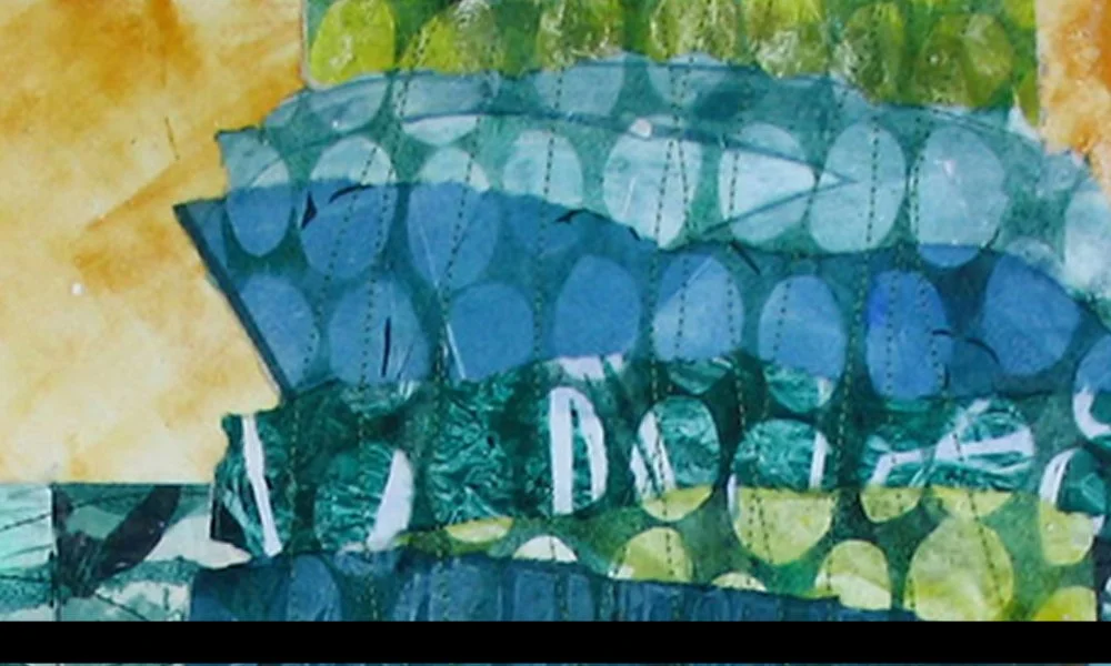
Here’s one of the works I’ll be exhibiting: And Then the Storm Was Over.
The lesson: Intentional Slicing Up a Background
I remember when I created this work that I had a lot of individual pieces I liked very much that were not very big. Dividing up the space into a grid gave me a way to use them. I wasn’t trying to disguise the slicing up. It became the organizing compositional device.
Some interesting things evolve. You can put two unlike images next to each other. You can slice up a larger image into segments so that its parts speak to one another across the grid.
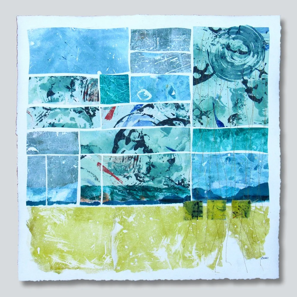
Here’s a work from my website that uses a similar technique. This is Beside the Quiet Morning.
This collage does not have as many segments as And Then the Storm Was Over. But, to me, the clearly visible horizontal and vertical diving lines provide interesting contrast to all the organic elements of the work.
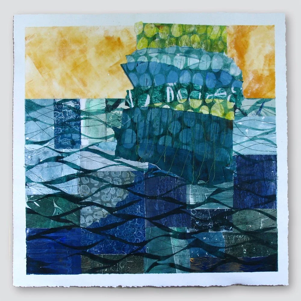
This is another work I’ll be showing in St. Augustine; In the Very Same Breath.
The lesson: Invading a Space – Across a Divide
The background has clearly defined sections: the sky above, the sea below. I took the big section with the circle patterns and inserted it into the sea below, crossing the horizon line and connecting the sea and the sky.
Here are a few pieces from my website that use that same compositional principle.
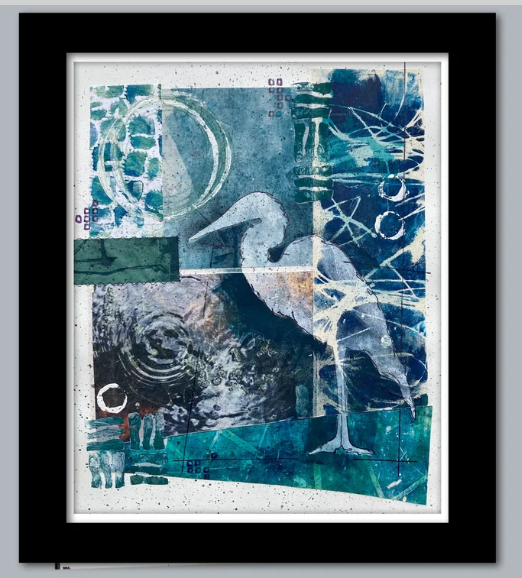
This is Within the Quiet Light.
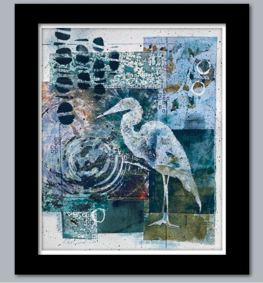
It’s very similar to the first water bird collage in this blog post. But, instead of showing space between the design elements, they overlap. The printed circles in the top left invade the space of the water below. The water section overlaps and invades the space of the vertical blue section on the right.
This is Deep Convergence.
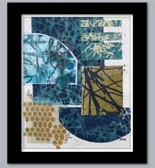
There are several space invasions. The half-circle at the top left invades the rectangle of the darker patterned fabric. The 3 aqua rectangles invade that same space from the right. And at the bottom, the olive rectangle with branches invades the space of the upside-down half-circle.
Last example: This is Trying to Fit In.
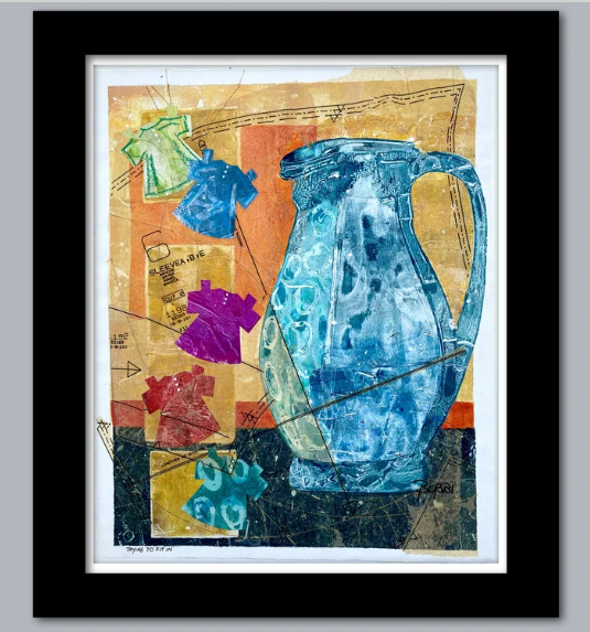
More than any of the other examples in this post, this work has one large, commanding composition element, contrasted with a number of smaller ones. And that large element, the pitcher, crosses the divide between the dark at the bottom and the space above. It invades that top portion, uniting the two sections.
As you create, it’s good to think about what design principles are at work in your artwork. If you are not a creator but love to look at artwork, seeing the design principles at work can deepen your enjoyment and appreciation
. . . . .
An invitation: Here are in-person exhibits I have coming up soon:.

For all the artmakers: Happy creating
For all the art lovers: Happy appreciating
Thank you for reading. I always enjoy questions and comments.
--Bobbi
How I keep in touch:
BLOG POSTS - once a week: Mostly about what I am creating in the studio. If you would enjoy receiving blog posts by e-mail, please subscribe here: I post and send by e-mail each Sunday evening. BLOGS-BY-EMAIL
NEWSLETTER – about once a month: Mostly news of exhibits and my way of introducing new work. You’ll get FIRST LOOKS at new artwork and members-only discounts. You’ll hear from me about once a month. NEWSLETTER