This week it’s back to the leftovers.
(I admit my sense of calendar time has been skewed lately. The weekend before Thanksgiving I exhibited in our local art festival. It creates a time warp where you are away from reality for 2 days, then suddenly come back. And then the holiday week does it to you all over again. What day is today?)
But I think I’ve got my feet back on the ground. (Cleaning the studio and putting things away helps.)
In my last blog post, I was experimenting with wheat paste and some fabric scraps. Both were leftovers. I created leaves. See that post HERE if you’d like to catch up.)
Now comes leftovers part II.
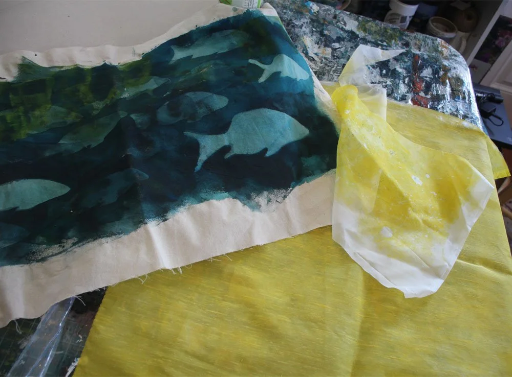
These are the fabrics I began with two weeks ago. The one on the right turned into leaves. Here’s a reminder of the premise of resist printing:
1. You cover up part of the the background with resist
2. You paint over with a contrasting color.
3. You let that overprint dry, then wash off the resist.
4. Result: you have a two-color surface, where the background color shows through.
This experiment was a little trickier, because the scrap fabric I am experimenting with (the blue-green image with fish) has both light and dark values in it. If I blocked out some parts, then overpainted completely with a darker blue, all those value variations— and some of the fish—would disappear.
What I’m interested in is creating is an underwater scene with lots of value variation and– I hope—some sense of light filtering through the water.
Here is that scrap piece of fabric with wheat paste applied.
I already used this piece in a previous experiment of sun printing. That’s where the lighter blue fish came from. I had painted the whole fabric the darker teal blue, put down stencils for the sun print, and the area behind them became lighter through the wicking out of the color as it dried in the sun.
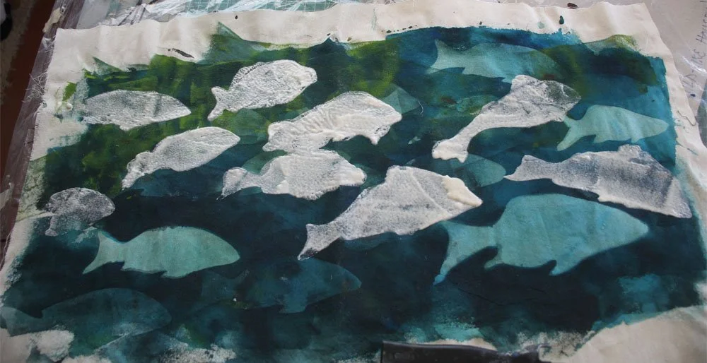
Now, I am adding new fish to the scene. The fish that appear white in the photo above are covered in wheat paste I stenciled on, and they will be new, additional fish.
Since the area around these fish is dark, I will need to overprint with a lighter contrasting color. I used a wet foam roller, rolling on a lighter green (pale green with a tad of white mixed in to make it opaque.) I rolled in a wavy pattern, so I would not cover up all the existing fish.
Here’s the result:
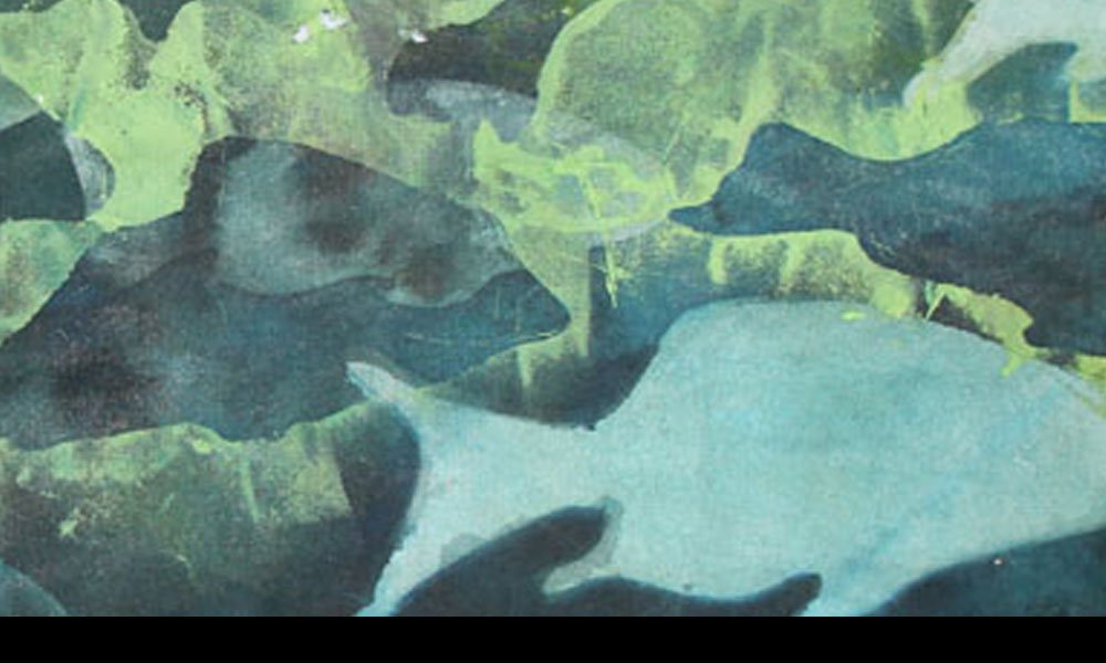
I find this result interesting.
I like the way the fish in the top third don’t appear at first. I find myself first looking at the color I rolled into the background, then the greenish-yellow fish seem to appear, as out of the shadows.
The whole panel now holds a bit of translucence.
The takeaway, for me, is that this simple surface design technique can yield unpredictable and interesting results.
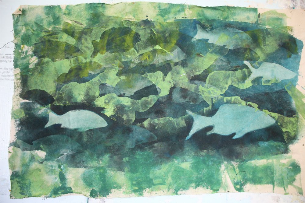
Here is another fish panel from a completed quilt, Nor Could Our Hands Catch Them.
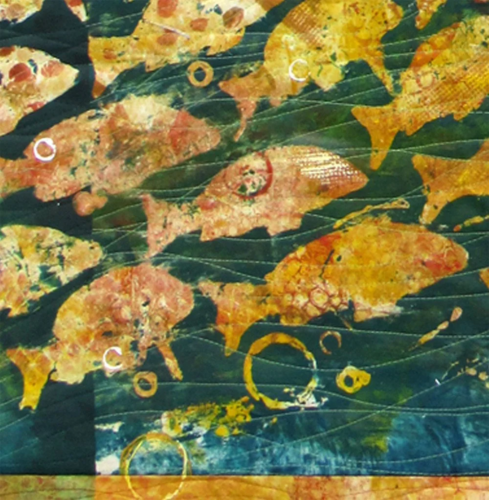
It was created with the same stencils I used in my new leftovers experiment. But, there is not nearly as much value playfulness. I painted that whole background in yellow and orange patterns. Then, I printed wheat paste fish, overpainting the whole panel in the darker green. (I kept it semi-translucent so the glow of the yellow would show through the water.)
I like this panel too. But it is quite different from the new one.
An interesting experiment would be to keep a palette constant through printing a number of pieces, and keep the stencils constant, but play with varying the position of the dark and light values.
Maybe, next time I need some experimenting . . .
. . . . . .
For all of us: focus each day
on the good that needs to be done in the world.
Be part of doing it.
Thank you for reading. I always enjoy questions and comments.
--Bobbi
How I keep in touch:
BLOG POSTS - once a week: Mostly about what I am creating in the studio. If you would enjoy receiving blog posts by e-mail, please subscribe here: I post and send by e-mail each Sunday evening. BLOGS-BY-EMAIL
NEWSLETTER – about once a month: Mostly news of exhibits and my way of introducing new work. You’ll get FIRST LOOKS at new artwork and members-only discounts. You’ll hear from me about once a month. NEWSLETTER