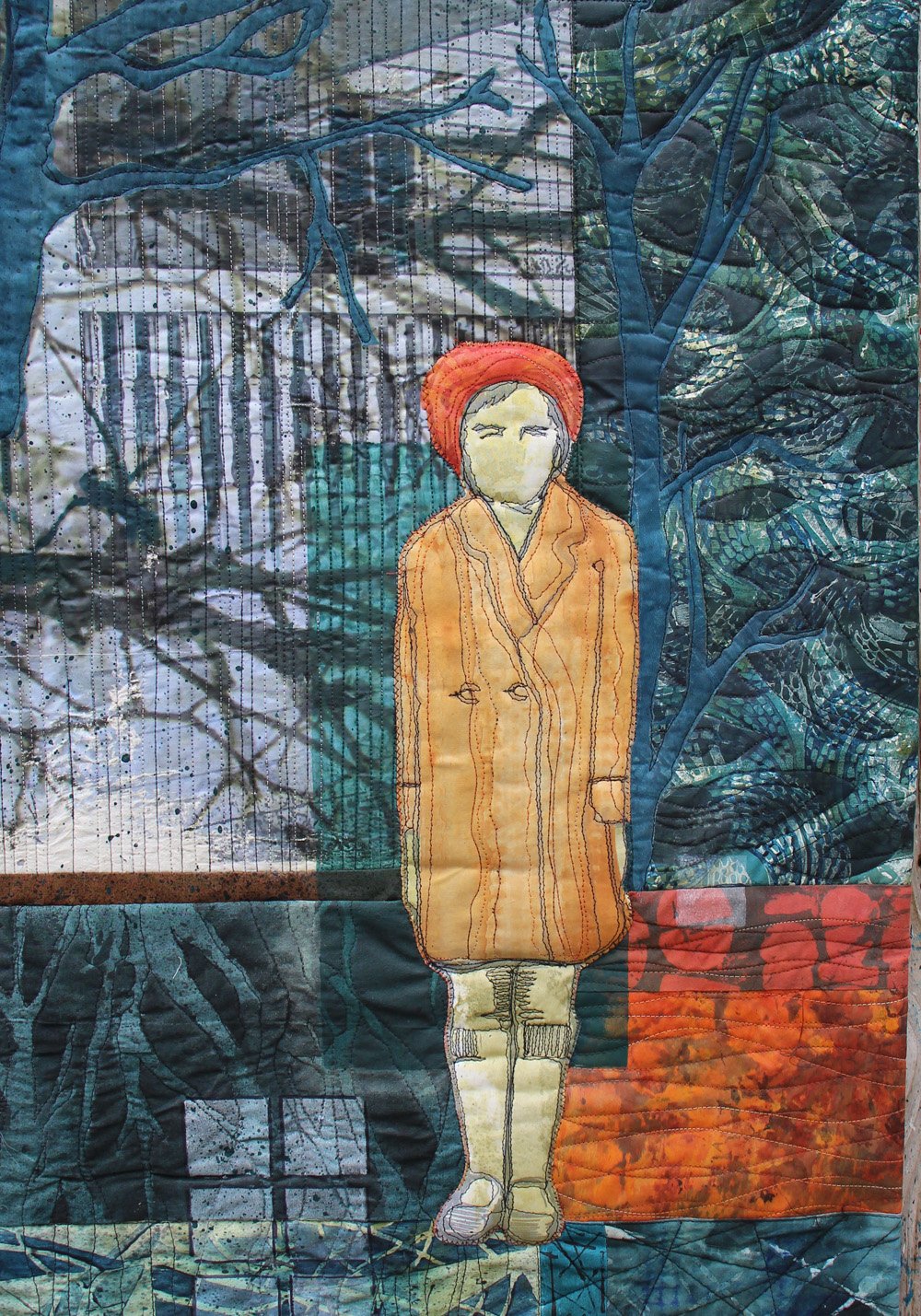
This morning as I spent some time reading on the porch a picture came to me of my mother’s profile reflected in the window of a train. Outside her window was the landscape of the American South one sees along railroad tracks. We traveled from Baltimore to Florida in trains many times when I was growing up. I must have seen my mother’s face like that.
But I don’t know where that image came from today.
Some word in the poetry I was reading triggered a nerve which touched off another which conjured up an image.
I was listening to the sound of the little wren in the birdhouse just above my head outside the screen porch. It has a wonderful and recognizable warble when it lands and calls out, “Here I am.” I am sure I am not the one she means to notify. But, so far, I have not seen a partner.
Sometimes the wren also pecks on the birdhouse, a little like a woodpecker, but she’s not digging for food. She just likes to peck-peck-peck after she lands.
And the air was very cool as the sun was coming up. I noticed how it felt on my arms. My feet were comfortable under a blanket.
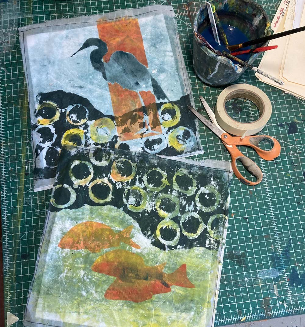
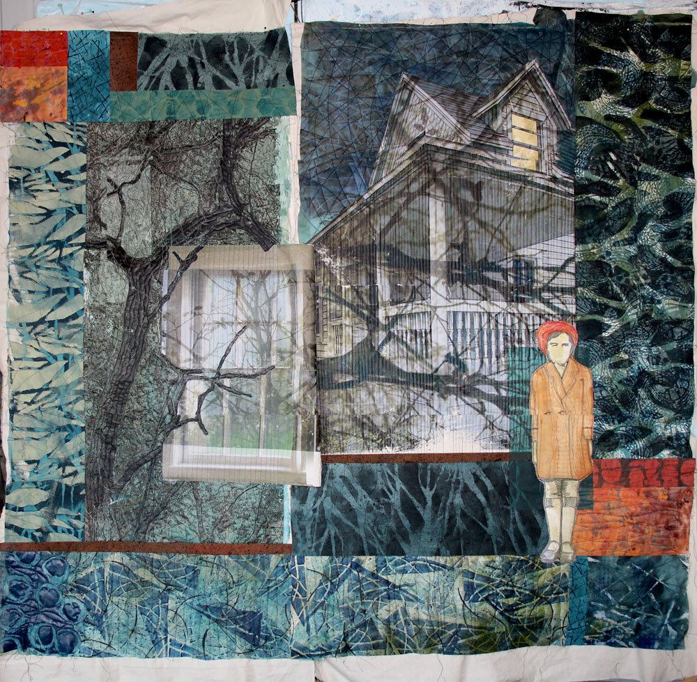
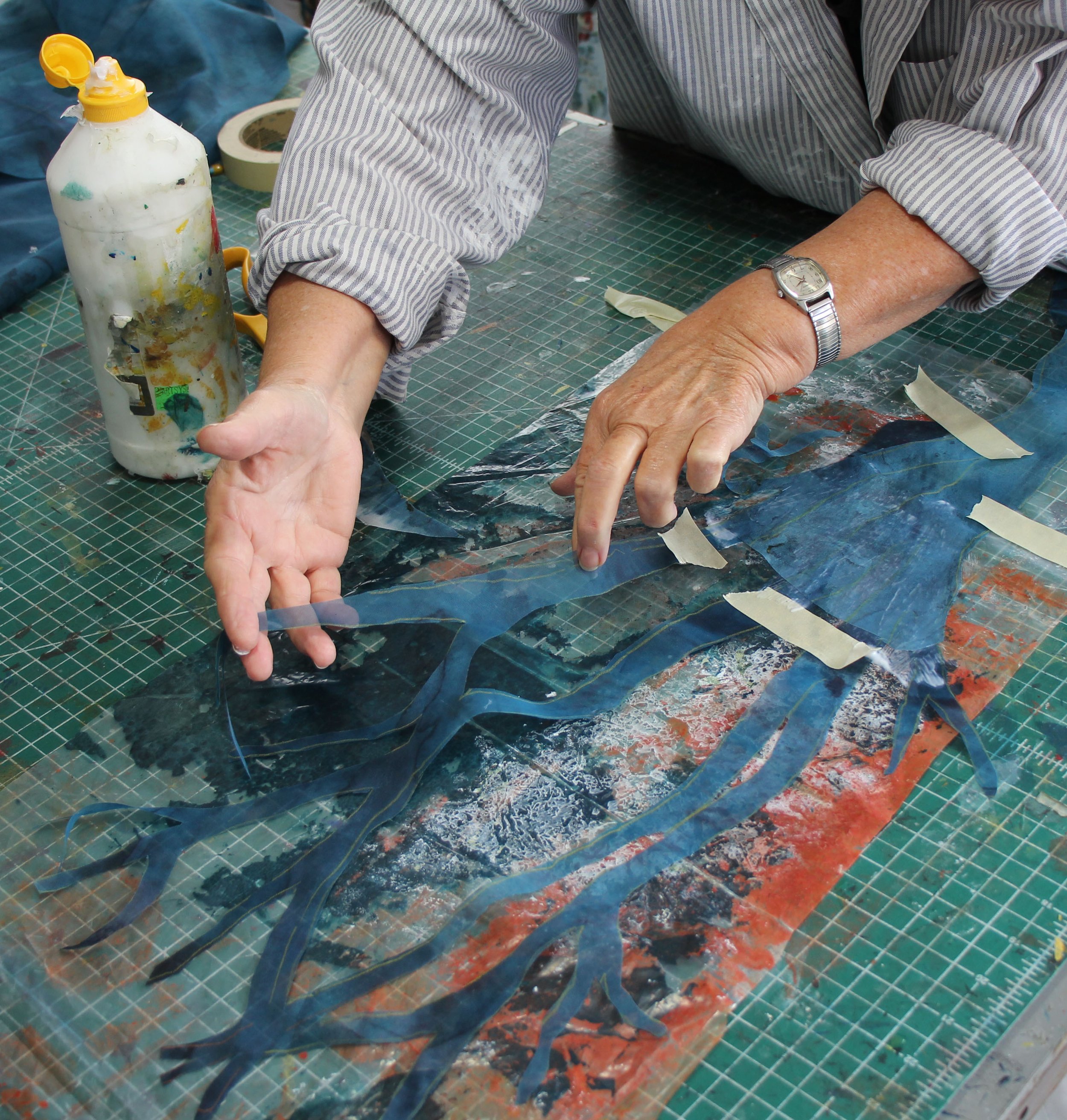
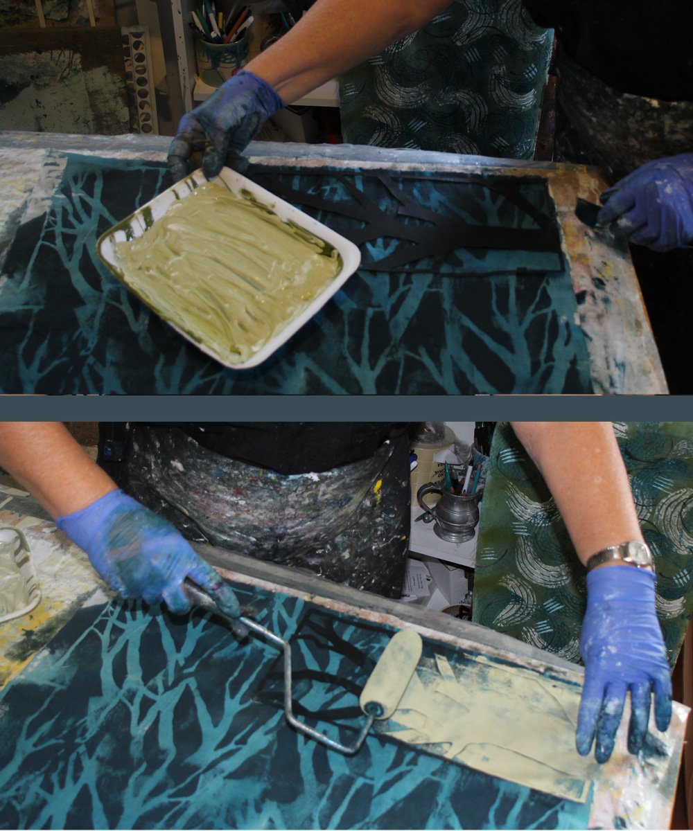
I was also remembering an NPR interview I listened to while working in the studio this week. An author who teaches writing was talking about “A Thousand Words a Day.” As you might guess, she advocates breaking down your BIG writing goals – like writing a novel – into small pieces. What you can reasonably accomplish in one day. And then do it again the next day. (Sounds like artmaking.)
I am about a third of the way through James McBride’s memoir The Color of Water. Having just read three of his novels, I was excited to dive into this book. It is even more wonderful than I could have hoped. There’s so much to love. His writing craft fills every paragraph with rich details: smells of the house, sounds of the neighborhood. His clarinet. The rough interactions of the twelve siblings.
He absorbed these details and worked them into his art. It becomes a revealing and insightful portrait of his mother.
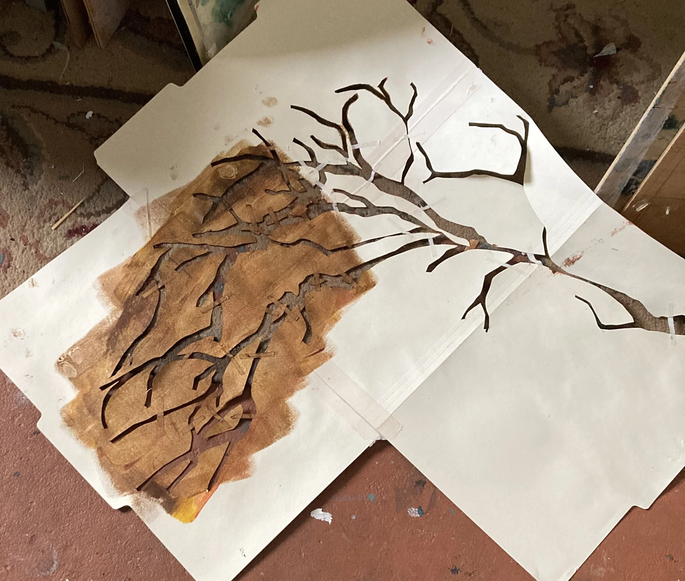
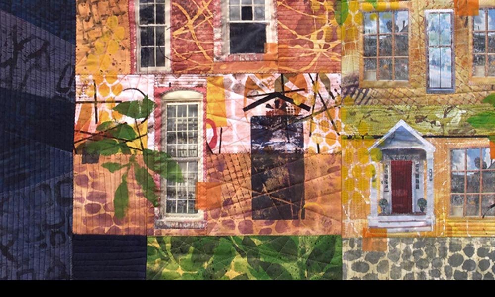
And so now I am back again to an image of a mother. My mother’s face is now in the window of the dining car, where there is a small vase with flowers on the table silhouetted against the window, and she is enjoying the smoke she could not have in the regular coach compartment.
To write. To make art.
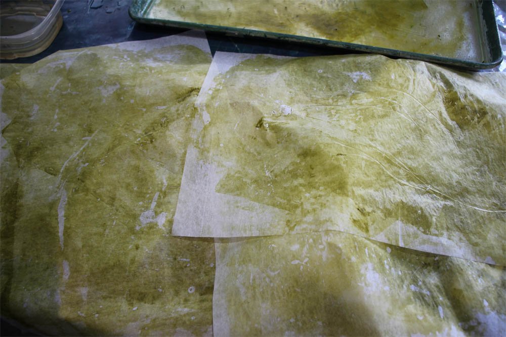
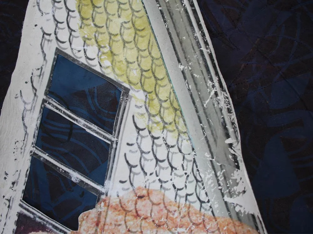
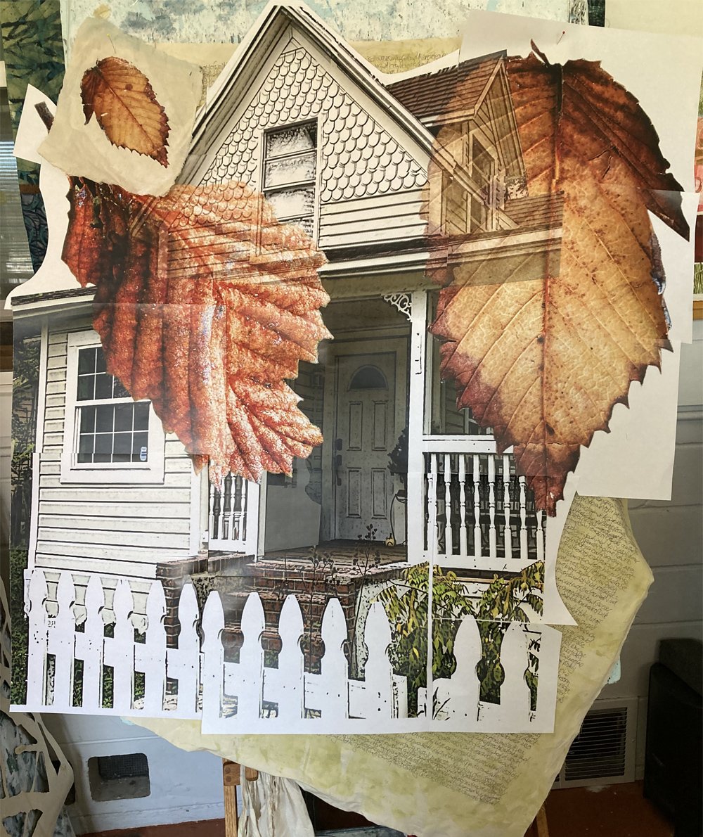
There needs to be time to absorb details and process them.
Then do the work of arranging and rearranging them.
At least in some small way, faithfully. Every day.
….
One last thought – inspired by the sentence about my mother and the vase on the table. I discovered this week, while volunteering in kindergarten class, that “vase” is not a word kindergarten children know. Not the children in my class. (A worksheet with a picture asked the children to identify the beginning letter of the item depicted.) Most called it a jar or a bottle.
Pour into every child you know as many details, images, stories, words, explanations, questions, smells, sounds, touches and experiences as you can. For many children, their vocabulary of life is very small.
…..
For all the artmakers: Happy creating
For all the art lovers: Happy appreciating
Thank you for reading. I always enjoy questions and comments.
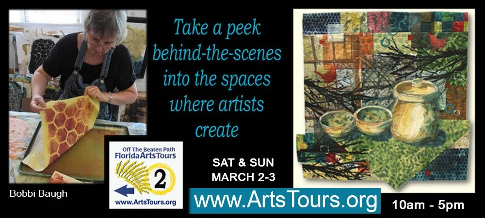
--Bobbi
How I keep in touch:
BLOG POSTS - once a week: Mostly about what I am creating in the studio. If you would enjoy receiving blog posts by e-mail, please subscribe here: I post and send by e-mail each Sunday evening. BLOGS-BY-EMAIL
NEWSLETTER – about once a month: Mostly news of exhibits and my way of introducing new work. You’ll get FIRST LOOKS at new artwork and members-only discounts. You’ll hear from me about once a month. NEWSLETTER